
Publication for Degree show documentation 2– Publication PDF
drew-degree-show-proposal-3– Final Degree Show Proposal PDF
Degree Show Website
Project Space 5
In project space five with Louise Webb
Changing the environment:
- Carpet – carpet within the space was an initial thought that we have decided will not be necessary due to lack of funds, time and necessity. Because we are using carpet like materials in our work a carpet flooring might distract attention away from the work itself.
- Painting the walls- We have decided to paint the walls to add to the work, to generate interest and contrast between the objects sat up against it and around it. Enabling our shared interests in colour to be expressed not just in the work, but the space in which the work is experienced to enhance this further. Our initial thoughts centred around the colours purple and yellow.
- Lights- Lights may be used where necessary and natural light illuminated, using only led light sources to minimise reflection and to generate even light throughout.
- Projection- Projection is not a current consideration for the space, however if it can be used in conjunction to the work then it is a consideration special due to the nature of my practice. However if this medium is used then it must be done in consideration to my fellow collaborators own practical intentions, not distracting you away from or across the space.
- Smells – Smells are a major consideration and we have used artificial flavourings and smells in the past to generate interest and to enhance guest experience, if a smell is relevant we will use it to enhance the space and generate interest to a particular work.
- Materials- The materials within my own practice has changed dramatically and the list pf objects and items are growing and growing. The work combines the sue of found and bought objects form plastic cartoon, bowls to metal, wood, perspex wool,sponge,gloss paint, fabric, spray paint and ceramics just to name a few.
- Painted Elements- The painted elements are slowly becoming sculptures in there own right extending from the wall and into the space in which they situate playing with the structures and systems that form sculptures to effect. Questioning there reality as a painting or sculpture, forcing the viewer to think about the artists intention. Every elements added will be considered for the space, making sure that theres balance between mine and fellow student Louise’s practice.
- Walls- Me and Louise have discussed the opportunity of adding another wall within our space and have seeked advice from estates to see if this is viable. The wall in question would be placed over two windows ,which would almost double our available space. The windows let in unwanted natural light and prevent objects from being attached to the wall. A wall would eliminate this concern, generating more space to hang and place our sculptural items on the day of installation.
- Monitor- We have decided to place one monitor into the space showing a decided selection of both mine and Louise’s video works on a loop to show and explore our aclectic working process.
The Space: positives and Negatives:
Because of the nature of the space a tactical consideration must be considered and well organised/Curated. Through artist exploration and the new found use of coloured/bought and generated materials sculptural aspects are starting to form within the work. the materials are starting to come of of the wall and into the centre. Materials that reflect my interest in pattern,rhythm and order are starting to form. Binding new additives which shape reality, new textures that when combined create layers and layers of emotions, feelings and textures to enhance the experience of observation. The Space has many positive and negative features. It enables us to curate a show with no fear or worry of the work becoming distracted from other peoples work
Artist Inspiration:
Taking important inspiration from four artists in particular, Peter Halley and Jessica Stockholder, Richard Tuttle and Raushenbourg has helped guide my ideas centred around the work itself. Forcing me to question Material and how I can regenerate painterly marks using found and bought objects. Tuttle has helped me to understand how to push material to the extreme looking at how the minimalist of gestures and pairings(assemblage) can create work that appears playful, holding onto a sense of youth. I want the work for the degree show to do just this to remain Playful and vibrant, not getting over complicated, yet holding onto that sense of materiality which is evident in Jessica Stockholders, Raushenbourg and Richard Tuttles practices. Taking objects that are not necessarily considered traditional artistic materials and making something new from them. Its becoming quite an interest point for contemporary artists today and the every day object has become a real discussion point in modern art. Peter Halley has helped me understand the importance of scale and line to define and push back art work into a new way of observing, considering has ideas of the cage or cell to force and push back specific elements when they become to complex to observe.
Materials Used In the Show:
Materials Combining materials prior and on the day of installation will enhance the work creating a more intense sense of observing. The use of a range of materials act as painterly marks that extended or protrude form the wall or floor. combined with actual paint that is applied in a range of manors from dripping, brushing, rolling and splurging not the painted surface . Ive created the works as a series that will hopeful work within the show together, enabling me to pair and combine a range of materials and objects in an assemblage on the day of install. Through Playing with a range of detached elements on the day it will be possible to consider where the objects them selves enter the installation environment. The aim is to use the extension,height and space surrounding the two dimensional work to add other elements that push away from the surface into and out of the space, shaping how the work is seen. These Materials Might Include:
- Rope- Long strands of hiking rope extending or dropping from specific points on the wall or surface.
- Sponge- Attached coloured blocks placed possibly on the wall or floor at an angle or away from the work itself.
- Metal – often using cage like structures to go over or add to an element. often placed onto of or to the side of a painted element to add interest.
- PVC plastic- This material already plays a huge part in the initial aspect of the work and sculptural elements, however I am still considering the possibility of these objects being single elements within the space. next to or away from a sculptural element on the wall at a high or low level.
- 2d Imagery ( Photographic Prints) – Photographs are a huge part of my practice and has become an important consideration for the degree show to place images next to painted works, like Jessica Stockholder within her practice, exploring the relevance between the objects I’ve painted and photographed. Using height and scale to place the images towards away and spaced from the wall itself.
- Side Board Samples- Throughout the year I have collected a range of coloured gloss offcuts of kitchen side boards which will be included in the show,placed directly next to painted elements and paintings to create and generate a sense of push and pull, forcing you to look at a complex object to then consider the simplicity of a much simpler object.
- Paint- both Matt and Gloss elements where used and applied in a range of manors onto the surface or sculpture.
The Paints we choose:


The paint colours we choose for our space was very much considered. Both Me and fellow Collaborator Louise wanted to make sure we choose colours that where not used in our work, but had some kind of relationship to the colours inherent within our practice. The colours needed to be vibrant whilst making sure we choose polar opposites that are complimentary for the space in an aim to prevent the space from becoming to overwhelming or distasteful to the viewer when observing in the space itself. We decided to go for a Matt finish to the paint, because of the nature of the light within the space and the material qualities of some of my own practical work. Gloss as a paint form would of overtook some of the elements, leading to a complex set of shadows and angles within the space in which we did not inherently want. We looked at a variety of shades of both colours and decided to go with the two paints above comically named Bumble Bee and Wizard. The two paints captured our attention because of there Vibrant finish and colouration when dry. We found the paint to be fairly decent in quality. The act of applying this to the surface of the wall was very easy and un- complex. The paint only required two solid coats of paint to cover the entirety of each wall. However the paint did scratch easily and a range of touch ups had to be made on installation week to cover up any marks, bumps, or scratches made within the space when installing the work overall.
Considering scale:
Scale has been a major consideration within my own practice but also as part of our degrees installation. The nature of the space means that scale has to be considered because of the lack of space in which we can inhabit. The paintings started of earlier on in the term as large scale individual pieces, Now they have become relatively smaller in scale, but consist of three or less parts. The work often extends not portrait but landscape at a range of heights on the wall itself. Hopefully this will maximise space while still maintaining scale but on a more combined manor. The work often turns to photographic imagery as an element that becomes combined with painted objects to enhance the sense of how the work is made and to contrast between the two dimensional painterly quality and the sculptural elements upon a three dimensional surface. To Summaries:
- Extends Landscape.
- Made up of three or less elements.
- Range of Materials
- Often using a photographic image as an element.
Curation Layout Ideas:
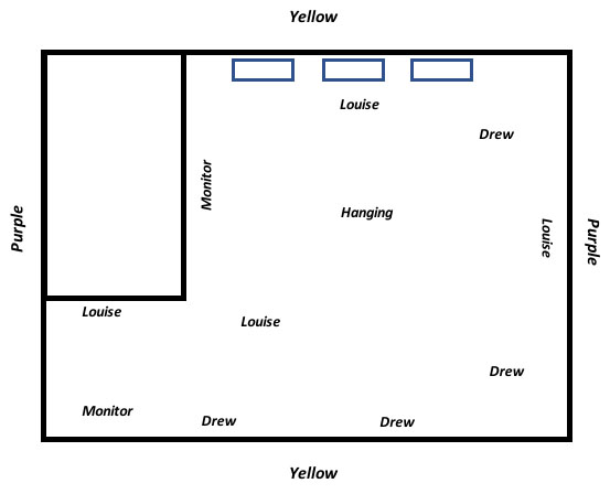
The Diagram above is a rough plan and idea of how both me and Louise Webb is going to curate the space as a whole on the day of installation, playing with the scale and style of the work to effect to generate a specific style and format for the show to follow. We have decided to paint the walls yellow and purple acting as a strengthening point that binds together our interests in colour. We have given each other a wall each to hang work and a section of floor space to show sculptural elements.
Works That will be Included In the show.:
All the works below will be edited during hanging, new elements will be constructed when fitted in the space to define the work further, as installation takes place.
1.
 Drew Alexander Burrett
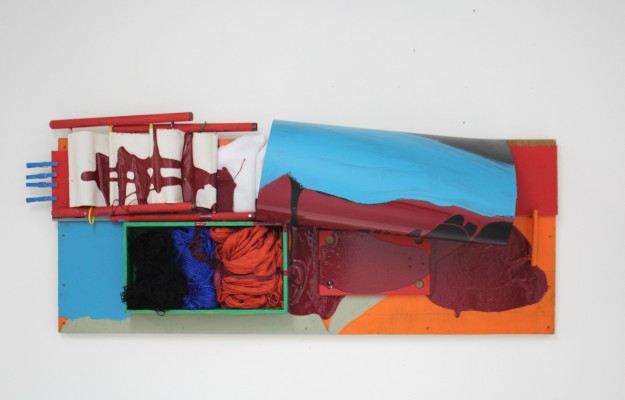
Signature Maroon I
PVC Plastic on wooden Door Panel with Handle, wool, scarf, and pegs.
Oil, Gloss, Spray Paint
2.

Drew Alexander Burrett
Signature Turquoise II
PVC Plastic attached to a Wooden Construction with Brush,Wool, Metal, sponge and Plastic tubes alongside Painted elements.
Oil, Gloss, Matt. Spray Paint
3.


Drew Alexander Burrett
Signature Lariat Diptych III
PVC Plastic attached to wooden Structure with Rope, Pipe Cleaners and Wool
Oil, Matt, Spray Paint
4.


Drew Alexander Burrett
Signature Aureila IV
PVC Plastic attached to Wooden Structure with Wool, Floor underlay, Draw Protector and Fabric
Oil, Matt Paint
5.


Drew Alexander Burrett
Signature Cobalt V
PVC Plastic held In place by Cable Ties with Plastic Containers, Metal bottle and Wool alongside painted elements.
Oil, Matt, Spray Paint
6. This Work ended up being taken out:

Drew Alexander Burrett
Signature Mignonette VI
Fabric on MDF with Coloured acetate, Plastic Bowl ,Plate, Yellow Straw, Coloured Foam and wool
Oil,Matt, Spray Paint
7.

Drew Alexander Burrett
Signature onyx VI
Altered Plunger and Oil Pipe with Straw, Draw protector, Pipe cleaners and Wool
Acrylic, Spray Paint
8.

Drew Alexander Burrett
Signature Mignonette
PVC Plastic on Board with Fabric and Acetate
Acrylic, Gloss Paint


Drew Burrett and Louise Webb
Bumble Bee and Wizard
Video on monitor
Drew Burrett and Louise Webb
Bumble Bee and Wizard
Kitchen Side Board leant on wall with Metal Green frame and wooden elements.
Choosing Titles for the works.
Over the last two weeks before hand in I’ve been exploring and discussing a various range of title ideas and have came to a solid conclusion on how I want the titles to come across. The nature of the work is very playful and I have been debating to make the names of the work follow suite, however Ive decided to let the objects speak for themselves, going with more traditional and coded titling process. Each Title begins with the word “signature”, which is another word for painterly expressive mark making. Signature represents an identity, a mark made by the action of applying a material to a surface. Alongside this I have placed a scientific name for each colour used within the work to define the importance of colour within t my practice. This is followed by roman numerals to express my interests in pattern, repetition and order over the controlled chaos of each element within the work. Ive labelled each material coherent within every work in a blunt and un romantic manner, refraining from hiding any and all aspects of there materiality. Stating the nature and objectivity within and out of the notion of everyday. The work follows a dialogue of experience. I don’t not want the title to create any form of link or reaction to how you view the work, only aiming as a classification system that would only be obvious to the artist and the artist alone. The series explores the painterly marks and colours at its purest and the labels must not refrain from the act of interacting within the space.
Business Card Design For Degree Show:


Postcard Multiples Design:


These Necessary additions will enable anyone who is interested in the making of the work to engage with me the artist on a personal level to enquire about the nature of the work overall.
The Space on Install day: 15/05/2017


The degree show space took over a week to complete due to its complex painting requirements. The act of painting the space purple and yellow was a cumbersome idea, but the finalised look overall was worth the high trips up ladders and being covered in paint, our ideas came to reality and the plan we created prior to install was adapted and changed throughout the week, works where taken out, repositioned and replaced where and when it was necessary.
Final Degree show Outcome (19/05/2017)


