
James Turrell


James Turrell has slowly became a very important artist within my practice to observe in more depth, His use of bright neon colours to create and define a new space is inspiring. The act of creating such an environment using lighting is an area In which I am trying to achieve within my practice and work overall. This sense of how lighting can generate specific moods, creates an atmosphere that changes and shapes a viewers perspective of the work acting almost as an illusionistic tool that governs how we react within and out of the gallery setting. Colour redefines the space, light changes how we see understand the architecture that surrounds us, making us consider some of the less important areas of the space, drawing focus, through colour into spaces that are cleverly designed hidden and reformatted constantly to shape the environment in which we all situate. James Turrell has helped me to understand where I am going wrong within my own practice questioning the relevance and importance of colour, light, position, scale and the space the work situates to the possibility of its failure or success.
“My work is more about your seeing than it is about my seeing, although it is a product of my seeing. I’m also interested in the sense of presence of space; that is space where you feel a presence, almost an entity — that physical feeling and power that space can give.”
“My work has no object, no image and no focus. With no object, no image and no focus, what are you looking at? You are looking at you looking. What is important to me is to create an experience of wordless thought.”
James Turrell
I love how James Turrell is trying to create a pure experience where as he describes the act of looking is the work. “You are looking at you looking.”Space is an important factor to his work, although I do not feel that this would impact the space at all. He could make any space come alive with colour. It all falls down to careful, design consideration of the space and how that makes the audience feel emotional and aesthetically .
Key Words:
- Experience
- Space
- Form
- Architecture
- Mood
- Atmosphere
- Lighting
- Recess
- Dimension
- Senses
Colours
- Primary
- Secondary
- Tertiary
Artistic Movements
- Abstraction
- Deduction
- Reduce
- Minimalism
Peter Halley


Peter Halleys works explore abstraction in its purist form often describing his compositions containing lines, shapes, and textures as “Prisons” and “Cells” in an attempt to draw attention to the geometricization of social space in the world in which we live. I am particularly drawn to his use of Textured mark making to draw interest to certain aspects of the painterly works. His use of composition and repetition. He has dramatically influenced the way in which I tackle my video creations, which are slowly becoming much more textured and static in there approach. His use of form to describe the social condition fascinates me deeply. the idea that a painting acts a a cell to explore the restraints of social space and the social condition. How the world is becoming Contained and controlled by the objects and media that surround us. He draws attention to these issues by using the purity of colour and texture to enable the viewer to see only what is required, the purist form or cell like structure, enforcing a positive approach to viewing.
“The deployment of the geometric dominates the landscape. Space is divided into discrete, isolated cells, explicitly determined as to extent and function. Cells are reached through complex networks of corridors and roadways that must be traveled at prescribed speeds and at prescribed times. The constant increase in the complexity and scale of these geometries continuously transforms the landscape…Along with the geometrization of the landscape, there occurs the geometrization of thought. Specific reality is displaced by the primacy of the model. And the model is in turn imposed on the landscape, further displacing reality in a process of ever more complete circularity.”
“While the analysis of themes in the mass media is no doubt significant, an ideological exploration of geometry can be still more so for despite the profusion of media images in contemporary culture, geometric signs still remain the most ubiquitous and influential in our society. At almost every instant, we are confronted by countless geometrical signs, even in environments that are free of media signs….it is geometric signs in the form of art, architecture, and statistical analyses that the managerial class reserves to communicate with itself.”
“The cell. Its ubiquity reflects the atrophy of the social and the rise of the interconnectivle. At the same time that the advent of piped-in “conveniences” has made it unnecessary to leave the cell, it has also made it impossible to leave the cell…In the planar universe, only color is capable of coding the linear with meaning: Coloured lines on maps distinguish the character of highways. Wires are colored to mark their purpose. In hospitals, one can even follow colored bands on the floor through labyrinthine corridors to one’s destination.”
“The modern conception of man as a machine is more economic than biological in its accent. It refers to the human robot rather than the human animal, and suggests an efficient control of the costly movements of the body, a submission to some external purpose indifferent to the individual. . .Thus the social is finally becoming the site of “pure abstraction.” Each human being is no longer just a number, but is a collection of numbers, each of which ties him or her to a different matrix of information…With Mondrian, a decade later, any reference to specificity is gone and the world is described as an utopian grid of abstract flows and forces.”
Peter Halley
Key Words:
- Cell
- Formation
- Order
- Society
- Texture
- Repetition
- Structure
- Two Dimensional
- Surface
- Material
- Scale
- Rhythm
- Order
- Balance
Colours:
- Primary
- Secondary
- Bright
- Neon
Artistic Movements:
- Geometric
- Abstraction
Frank Stella


Frank Stellas work has changed dramatically throughout time and in the later part of his artistic practice his sculptural assemblage are becoming much more dimensional, colourful and complex. The works combine a range of different materials together in harmony. Frank combines painterly marks alongside of loose fluid mark making, pushing and pulling elements forward and backwards towards and away from the screen. Throughout year three,his way of working is becoming even more relevant. The combination of material to generate painterly marks alongside of actual paint as a material fascinates me and is a frequent technique being applied within my own practice. The need to combine materials that have a painterly quality and aesthetic gives the painting dimension where they become something new entirely. Shaping the works scale to a much larger and grander size and perspective. Frank Stella wants you to look at each material exposing every element to the audience to make you consider its integrity. what my biggest question about Franks work is why the quick change in artistic style and practice.


He’s gone from a practice that is fairly restricted and confined to the lines drawn out before him. Whereas in his more recent approaches to making he has become a lot more loose, free with a sense of uncontrollability. His work explores paint as a material, pushing his interests in line and shape into three dimensional penetrating sense of form that includes and entices the space forcing you to reflect more contently at the work considering its creation. Shape is still apparent but in a much more looser and less refined manor.
“A sculpture is just a painting cut out and stood up somewhere.”
“But, after all, the aim of art is to create space – space that is not compromised by decoration or illustration, space within which the subjects of painting can live”
“I was worried in the ’80s that the best abstract painting had become obsessed with materiality, and painterly gestures and materiality were up against the wall”
No art is any good unless you can feel how it’s put together. By and large it’s the eye, the hand and if it’s any good, you feel the body. Most of the best stuff seems to be a complete gesture, the totality of the artist’s body; you can really lean on it”
- Assemblage
- Material
- Texture
- Scale
- Shape
- Form
- Paint
- Mark Making
Colours Used:
- Primary
- Neon
- Gloss and Matt
- Pastel
- Metallic Elements
Type of Work:
- Abstract
- Geometric
- Sculpture
Thomas Scheibitz


“Scheibitz also paints the surfaces of his medium- density fibreboard (MDF) sculptures with lacquer colors that are analogous to if more intense than the hues seen in his paintings. And just as the disparate shapes that are agglutinated in the oblique images of his paintings, so the cubes, spheres, cylinders, and polyhedrons of his sculptures— however articulated like limbs of a human body or blocks of an architecture—descend from the same vocabulary of prototypes that the artist compiles from his reconnaissance of the city and of history.”
“Parallel to the compounding of shapes drawn from the lexicon of images that art, advertising, industry, magazines, and newspapers provide to his iconographic notebooks, Scheibitz evokes in the titles of many of his works references to multiple experiential fields, reflecting in them the Fluss (“river” and “flow”: permanence and movement) and the Quelle (“source”2 )and “spring”: quotation and invention) of signs converging in the painted or constructed image.
Thomas Scheibitz work questions the forces of balance between object and material constantly looking for sources of inspiration from abstract objects found amongst a range of different sources, through first hand photographic material to magazine cutouts and newspapers. Thomas combines these sources of interest to him in a composition that reflects the nature of the form itself, through a series of abstract shapes and cylinders that often represent the objects, material and forms collected, sketched and composed within his studio. These shapes then are translated using paint, changing depth, scale and colour depending on the application of each brush strokes. He plays with both the solid colour as a paint application and the more expressive brush strokes often combining the two in harmony to push and pull forward specific aspects of the painting ,drawing the eye to a specific area of the painted surface. His sculptural approach to making I do not feel is as successful as his painterly works. The artistic touch is lost from the work, often relying on assistants to fabricate the structures. I subjectively feel sculpture is more successful when the hand of the artist, who may not be a skilled craftsmen or carpenter puts objects together, when you can see the imperfections and the combinations of paint marks and brush strokes. For me Thomas Scheibitz sculptures feel like they where made because he can make them, lacking this painterly and expressive feel that the paintings give of.
Key Words:
- Colours
- Form
- Brush Strokes
- Shape
- Restricted
- Loose Brush Strokes
- Space
- Scale
Colours Used:
- Bright
- Primary
- Secondary
- Reflective
- Gloss
- Flat
- Painterly
- Monotone
Type of Work:
- Sculptural
- Abstract
- Painting
Jessica Stockholder


“I don’t think there’s any single finished point for a work. It’s done when something’s happening with the work that feels like a balanced, coherent disharmony. That’s one way to say it. And where if I keep working on it, to discover and struggle with new problems, I’ll obliterate the ones I was working on. I could keep working on it, but it’d become something different. And I value what’s here, at the moment.”
“There’s something about materials like copper, woods, stone, trees, shells. You walk outside and these materials are part of the world before we touched anything. There’s a feeling of pleasure that many of us have in materials that have some presence before us, like clay and wood and copper.”
Jessica Stockholder has become an important artist of research within my practice so far this term, combining paint, wooden and structural materials together alongside of plastic and fabric elements to create an assemblage of forms that question the function of the object. Pushing and pulling on the boundaries of making to underpin the artistic interests of the individual object itself. She works within a range of mediums from photography, paint, found and made objects created and put together in her studio by her alone. She talks a lot about the importance of being in the studio on her own, not requiring assistants but merely fabricators to generate certain objects that can only be generated by the machine alone. when observing the work it becomes clear from my point of view that the more contained smaller scale works have a greater strength and sense of interest about them then the larger installation works. Its the concept of the immediate and the intimate that makes Stockholders work stand out. The act of combining coloured objects and materials together to generate a structure that appears familiar yet not that entices the viewer to think and consider her practice and the works aims overall.
Key words:
- Assemble
- Form
- Combine
- Structure
- Material
- Surface
- Scale
- Object
Colours Used:
- Bright
- Primary
- Gloss and Matt
- Man Made/Artificial Colour Palettes
Type of Work:
- Sculpture
- Everyday Object
- Bordering on Minimalism
- Bordering on Symbolism
Alex De Corte


To Alex De Corte colour is an important tool, just like James Turrell colour acts as an experience creating a specific mood and or environment. The objects and items added to the scene create a mood, set the scene for a specific environment to appear generating a new way of observing an experience. He often places mundane everyday objects into the changed and morphed spaces that represent everyday activities or pleasures. Colours always have an impact on the way we view a space, shaping and changing how we feel about a space we inhabit. Alex tackles these feelings head on forcing us to question the nature of an object and there intentions within. The act of morphing the space on heightens the experience, the way we view the work, changing how we see the objects before us. Patterns interest the eye and draw us in to the act of losing even more.
Key Words:
- Objects
- Space
- Light
- Atmosphere
- Colour
- Installation
Colours Used:
- Primary
- Secondary
- Bright
- Neon
- Purple/Pink
Type of work:
- Everyday
- Environment
- Formalism
- Sculptural
John Baldessari


John Baldessaris practice does not have a direct reference to mine, but more of a conceptual one. What I take from John is his use of colour to mask, distract, remove images that lie beneath. Its a way of adding interest and distorting what lies beneath , changing the way the audience sees and reads the work. by illuminating the face, or specific body parts the images becomes one to interpretation, suggesting reference points and symbolic meaning to the act of the images removal. John Baldessari is relevant because of his dramatic use of colour as an act to remove information which is an important aspect of my practice. Removing, pushing backwards and layering materials together to create a meditative yet un-comforatble sense of observation within a given space.
Key Words:
- Adding
- Subtracting
- Colours
- Shape
- Image
- Photograph
- Found
- Collected
- Remove
Colours Used:
- Primary
- Secondary
- Bright
- Gloss
- Matt
- Neon
Type of Work:
- Photography
- Image
- Bordering on Abstraction
- Surrealism
- Pop Art
Gary Hume


I look to the work of Artist Gary Hume for inspiration not on a subject matter but on a method to apply paint to the surface. Gary Hume has a very painterly abstract practice that often lets the nature of the material in use which is often High Gloss paint to create a sheen and a sense of depth to a surface in which he paints on. Using Paint as a material not a medium to create the work becomes a painting in its own right. The work has this great sense of movement and the marks made by the paint generate a sense of flow and motion to the works them self. The act of using High Gloss paint gives the work a sense of Mass production. Taking away the notion of being hand made by the artist creating a crisp, professional mass produced look.
“I found that gloss paint suited me entirely, and its qualities still intrigue me. Its viscous and fluid and feels like a pool. Its highly reflective, which means there are layers of looking. You look at the picture and you look at the reflection in the surface behind you, then you look at yourself.”
I like this idea that the work contains three distinct ways of looking, you look at the picture, then the reflection of the surface behind you, then you look at yourself. The reflective surface acts as a window to look through and to understand. Given the work a new way of observing. Gary Hume often considers scale as being an important aspect of a narrative of making, looking at how a small scale painting cant possible contain the depth of a story on comparison to a larger work. Small scale to me is more intimate, personal and delicate in its creation. Larger scales work can appear intimidating and
“People constantly describe me as a formalist or even a minimalist, but im not really bothered with the rules of painting or the history of painting. My Approach is that everything is mine. I take what I can use from wherever, and then I forget where I’ve taken it from. But there is no point me making anything that looks like anyone else’s. ”
“A painting should be tough: it should have muscle, but I have to find some tenderness in it, too. There has to be that dynamic.”
Key Words:
- Form
- Removal
- Scale
- Placement
- Colour
- Movement
- Paint
- Loose
Colours Used:
- Pastel
- House Paint
- Gloss
- Muted
Type of work:
- Abstraction
- Minimilsm
Richard Tuttle


Richard Tuttle has a unique and playful aspect to his practical work. His artistic career spans across decades and that’s because of his rich and dynamic practice that uses a range of materials and artistic techniques to create a specific and desired effect. Tuttle often plays with found and everyday materials combined in an assemblage, considering there hanging as an important consideration to its possible success or failure. His use of materials such as fabric, found objects, paint, paper and cardboard has had a major and inspirational effect upon my practice. Its the way in which Tuttle plays with composition and placement that inspires me the most, taking simple objects placing them together in a way where the act of hanging was obvious to the audience. Where simple use of colour stand out amongst the nature of the material behind. Playing with this language between solid colour and muted colour pushing and pulling constantly. Multiples seem to be a key aspect of Tuttles works and he often builds a series of work formed of a specific set of materials and objects.
I have recently seen one of his shows in London with my fellow Fine art students during the end of March. He often has a major role to play in the installation of his work and influences and takes part in the decisions made to the placement of each work in the gallery. His curatorial practice is interesting and every works placement is considered to match the nature of each material in the work. Height, distance between each work and spacing is a serious consideration to ponder for Tuttle. He forces us to look up, round the bend of a corner, to look down and in a place you wouldn’t expect.
“Everything in life is drawing if you want. Drawing is quintessential to knowing the self. Art that survives from one generation to the next is the art that actually carries something that tells society about self.”
“In our culture, imitation based experience dominates reality-based experience. I find this an awful thing. But there are artists who know from the bottom of their souls that art is about the experience of reality. The reason we have art is because you cant get a real experience from the world.”
” If you’re going to be a visual artist, then there has to be something in the work that accounts for the possibility of the invisible, the opposite of the visual experience. That’s why its not like a table or a car or something. I think that that might even be hard for people because most of our visual experiences are of tables. It has no business being anything else but a table. But a painting or a sculpture really exists somewhere between itself, what it is, and what it is not- you know, the very thing. And how the artist engineers or managers that is the question.”
https://www.youtube.com/watch?v=EEoZpS4AWLw– Richard Tuttle interview- Artists are Like Clouds.
https://www.youtube.com/watch?v=th8cd8gwjUg– Richard Tuttle interview- Staying Contemporary
Key words:
- Materials
- Space
- Assemblage
- Hanging
- Position
- Pinning
- Scale
- Material
- Application
Colours used:
- Muted
- Primary
- Secondary
- Tertiary
- Pastel
Type of Work:
- Minimalism
- Abstract
- Formalism
Katherina Grosse


https://www.youtube.com/watch?v=HBfPMGS7XPo– Katherina Grosse – Painting With Colour- ART21
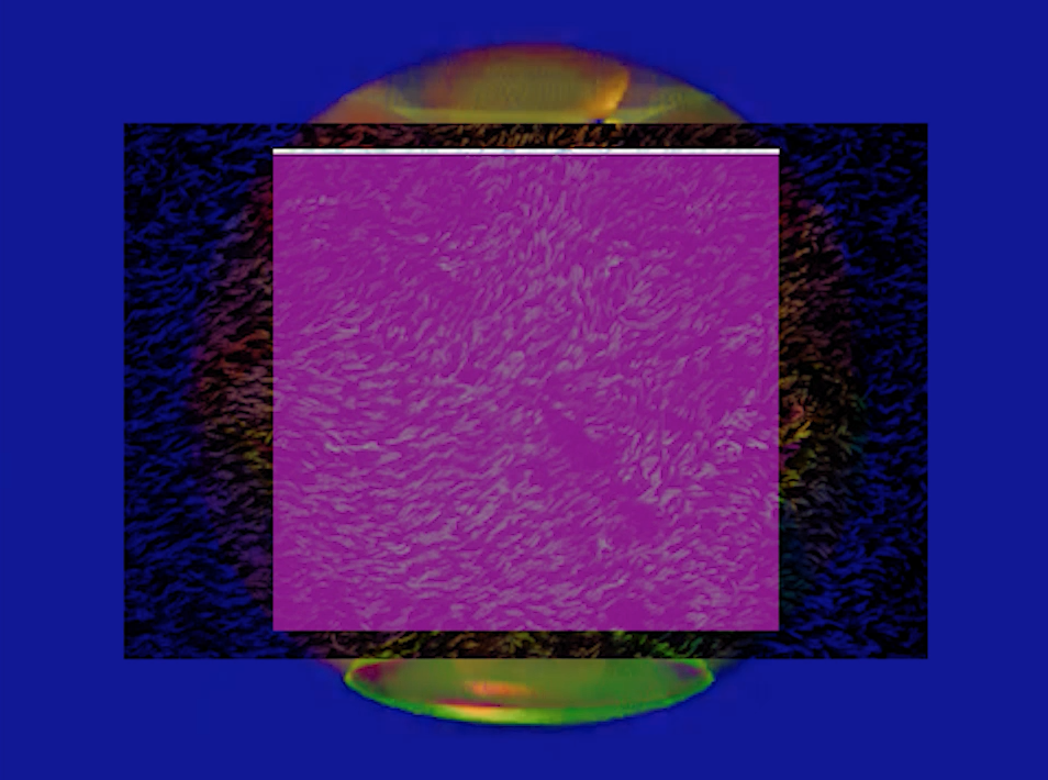
Katharina Grosse is an important artist to look at because of here key interests in colour and pigment as the means and basis for her entire practice. Grosse Looks to colour not as means to cover a surface or create a Painting or a sculpture but as the work itself often relying on Space and location to define the scale, position and layout of the works. The pigments are often made obvious to the audience extending from the wall, onto the floor ceilings and amongst door ways. The act of applying the pigment into the space, encourages the viewer to instantly have a reaction to the purity of colour in that space. Colour has a dramatic and consequential influence on how we feel within an inclosed environment. Each pigment is carefully applied to create a balanced and often overwhelming space. She applies these pigments in a variety of manners from Spray painting, pouring, spray guns, and pure pigment in the space. The acts of using colour has a lot of versatile history spanning from philosophy to psychology The fu disentails of colour go back to the human sensibilities of the mind and our reactions to observing colour as a way to generate a sense of individuality, identity and experience depending on our own Tastes, perceptions and social identities. Colour is a versatile substance that Katherina uses to her advantage to make a space change dramatically, completely eradicating its clinical appeal to am more chaotic yet comforting space that is defined purely by colour alone reflecting her own sensibilities around colour and Pigment as the means for the work.
” I am involved in it. I don’t experience “limits” as limits. There is no resistance when I am painting. The inside and the outside coexist. What appears in the image field is not subordinate to existing reality, it constitutes that reality. I don’t interpret reality; I understand reality as a performative activity that generates itself newly and differently, again and again.”
“My painting overlays the surfaces with levels of imagination and projection. I understand imagination as the undirected capacity of imagining things, and projection as a directed ability to choose in terms of “what will work versus what won’t,” which are both conditions of infinite potential. The coexistence of the imaginary and the materialized is experienced by the viewer as irreconcilable, as an encounter with a paradox.”
“Anarchy, chance, control, chaos—they are all illusion. Anarchy—I do not work against anything but with everything. Chance, control, chaos all suggest that there is a singular continuum organized by ideas of hierarchy and dialectic thinking. Our existence is not continuous.”
“I am not very familiar with the work of the Situationists. I really come from the history of painting. Among my questions are: How can a painting appear in space? How can the specific mode of thinking that painting requires and triggers be best put forward and made use of? Painting offers the ability to fuse notions of past, present, and future into one field. In that field, contradictory systems can coexist. If we could organize fields like that in real life, I wonder what that would do to our relationships and social contexts, or to society at large? Fear, anger, hope, and love would be disconnected from activities that usually lead to eliminating contradictory systems and could be used as energy sources.”
“The transition from imagining to acting (in painting) mirrors or equals the experience of moving from private to public space. I wonder if this could be compared to the step from the local to the global that’s being debated everywhere.”
“I need the brilliance of color to get close to people, to stir up a sense of life experience and heighten their sense of presence. I don’t intend to make them travel into another world or expect a particular reaction. The special thing about theater is that the presence of every audience member, and the genuine perception of each, has a direct influence on what happens on stage. The audience is not within the sphere of my influence. Rather, my work is in the sphere of their influence. What appears on the image field or on the stage is not subordinate to existing reality. It constitutes that reality.”
The quote above really interests me, this idea that colour can be used as a tool to get close to people, to generate an experience and heighten there sense of presence and perception in the space. Encouraging the audience( viewer) to interpret the work for them selves. By using colour Katherina believes that her work is influenced by the viewer and not the other way round. Its the audience perception and reaction to the act of observing in the space that defines and generates the works meaning. We are all subordinate to the act of looking and it part of human nature to find colour interesting. Through socialisation and illusion are minds becoming intrigued by Specific colour combinations, tonal ranges and contrasts. Complimentary colours such as Purple and Yellow draw attention because of there colour relationship. Through the means of an individual identity Katherina can let the colour speak for itself, defining an individual experience for each and every onlooker.
Katherina Grosse Talks about this notion of painting having the ability to fuse the Past, Present and Future together. Combining on aspect of life into one field of painting, The act of painting enables us to combine and use our imagination to form new ideas. Her question about the effects on life if we could fuse these fields together is interesting. Maybe thats what makes painting such an interesting concept to the eye, because it can generate the impossible, things that are not humanly possible. Its this ability to fuse the past and future ideas into a surface that creates a sense of nostalgia or excitement to the viewer. We look to the past to understand the present, but we cannot but make predictions of the future. The act of using colour, has a dramatic link to the surface of a colour or pigment. It can crack open a memory an emotion bringing back thoughts from the past, helping us to shape our understanding of the future. Colour plays a huge part of our daily life and understanding the key recipes for colour harmony, taste and definition is key to Katherine Practice but also my own.
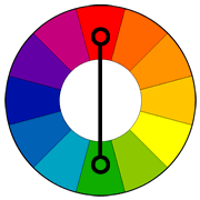 Complementary Colour Schemes:
- Red- Green
- Purple and Yellow
- Blue and orange
Situationalists International
The Situationist International (SI) was an international organization of social revolutionaries made up of avant-garde artists, intellectuals, and political theorists, prominent in Europe from its formation in 1957 to its dissolution in 1972. Essential to situationist theory was the concept of the spectacle, a unified critique of advanced capitalism of which a primary concern was the progressively increasing tendency towards the expression and mediation of social relations through objects. The situationists believed that the shift from individual expression through directly lived experiences, or the first-hand fulfillment of authentic desires, to individual expression by proxy through the exchange or consumption of commodities, or passive second-hand alienation, inflicted significant and far-reaching damage to the quality of human life for both individuals and society. Another important concept of situationist theory was the primary means of counteracting the spectacle; the construction of situations, moments of life deliberately constructed for the purpose of reawakening and pursuing authentic desires, experiencing the feeling of life and adventure, and the liberation of everyday life.
Artists Groups such as Surrealism, Bauhaus and Dada where formed.
Key Words:
- Colour
- Material
- Purity
- Form
- Scale
- Pigment
- Extend
- Space
- Installation
- Phychology
- Takeover
- Surface
Colours Used:
- Primary
- Neon
- Bright
- Pure Pigmentation
Type of Work:
- Abstract Expressionism
Robert Rauschenberg


Robert Rauschenberg is a key artist of focus for me within my practice, his diverse and unique work using an array of mediums relates to my interests within my own practice to being one to using an array of subject matters to create work that fits the needs of the idea or project in place. The way Robert Rauschenberg applied paint to a surface, on top of layers upon layers of different objects or prints is relevant to what I’m trying to achieve, Work that makes you think twice about what lies beyond it surface. Robert turned sculpture into painting. every object became a three dimensional study of paint pushing away from the traditional notion of the canvas. using a wide range of materials from metal, wood both created and found. They almost become assemblages of objects placed together in relation to the overall space in which it situates. The combination of paint applied over often screen prints and solvent printing to add depth and layering to the surface.
I have recently seen Rauschenberg at the Tate Modern. His work has really encouraged me to explore materials of an unorthodox nature. To push the act of creating to a new level. For me its this idea of the combine. A selection of assemblage objects that we do not see as traditional artistic mediums. Within my practice these notions are starting to emerge looking at Common everyday household appliances, craft tools and materials to generate the work. Colour and complex layering has always been of interest to me and the materials always form a major part of the work itself. But now the materials are becoming much more considered and the colours often altered to create desired effect. Theres always been this interest for me in Rauschenberg’s screen printed collages. Its when these screen prints have paint applied that the works become of interest. Its this idea of merging to forms imagery together, pushing from a flat image and becoming much more dimensional. Within my work I enjoy playing with this idea of adding and subtract, starting of with an image and adding, pushing and pulling elements forwards and backwards until a composition of balance has been created. Throughs seeing the show at Tate I’ve seen how diverse Rauschenberg’s practice was, he dabbled in many artistic fields from screen printing, minimalism, Assemblage, Scientific art, music and performance.
“I always have a good reason for taking something out but I never have one for putting something in. And I don’t want to, because that means that the picture is being painted pre-digested.”
“People ask me, ‘Don’t you ever run out of ideas?’ Well, on the first place, I don’t use ideas. Every time I have an idea, it’s too limiting and usually turns out to be a disappointment. But I haven’t run out of curiosity. ”
“I think a painting is more like the real world if it’s made out the real world.”
“The artist’s job is to be a witness to his time in history.”
“So that ideas of sort of relaxed symmetry have been something for years that I have been concerned with because I think that symmetry is a neutral shape as opposed to a form of design.”
Key Words:
- Sculpture
- Colour
- Form
- Found
- Created
- Layers
- Static
- Mark Making
- Impasto
- Scale
Colours Used:
- Primary
- Secondary Colours
- Pastel Palette
- Montone Elements
Type of Work:
- Pop art
- Expressionism( Partial)
