

How is the theme of the work Changing:
Throughout the entirety of BA3a and BA3b I have noticed a gradual change in theme, centred around the evolution of my video and projection work. The work has become more visually stimulating and aims to entice the viewer to feel a sense of comfort and amusement. The work has gone from being fast passed which is almost an overload to the senses into a more meditative state. Into work that explores the calming nature of colour focusing primarily on the influence colour has upon ones feeling towards the work. Colour has become a key focus and the frequent use of bright greens and purples means that the audience feel a specific mood or sensation from the work. The colours are carefully selected to work in balance, to allude and create attention that draws you into the visuals without taking you away from there true intention. The word meditative means a state of considered thought, to think and loose your self in your imagination. to Consider, reflect and rationalise what we are observing. Colour and lightings adds and enhances the human ability to reflect. It can alter how we reflect either in a positive or negative manner. The materials and subjects used in the video works are slowly becoming much more subtle focusing primary on the colour itself as the key focus of the work. Colour is a pure subjective element within art, but we as human beings through the use of language and symbolism attach some form of meaning to it. Each colour represents a significant part of the human condition. White being purity and red being death for example. Through combining colours in a specific way we can create an immersive almost un avoidable space where specific interactions influenced by the art itself can take place.
Key Words:
- Meditative
- Immersive
- Symbolism
- Condition
- Interaction
- Un-aviodable
- Purity
- Sensation
- Audience
- Subjective
- Visuals
- Intention
- Fades
- Pattern
Un-representational representation
This paragraph explores Drews viewpoint on the balance between un-rperesnetational and representational art. Forcing us to consider if the work within his practice can be both, forcing the viewer to feel a sense of unease about the act of observing.
A new theme under the ideas of un-represnantional representation has emerged. The work is beginning to question if abstract really exists, it borders on the edge of the everyday, form and shape however reducing it to mere elements within its structure which is defined within the boundaries set out by the boards size and shape. Elements placed in front force the representation to be questioned by its original origins (where the image came from). Playing with complex forms and shapes combined with simple geometric structures and colour palettes placed on top enable me to play with the act of looking, hopefully forcing the viewer to question there works true reality. They act as an un-represeantional window like the video work into how me the artist sees the world. They become a representation of the human psyche, the function of how my brain sees the world through the process of layering that evidently takes place. Layering is a way to create an aesthetic, that balances out each element within a composition. The aeshetic quality of an image and or form has always been a key importance within my practice. Maybe I haven’t spoken enough about its importance throughout the development of my practice, but I’m noticing how relevant it is today. Every work I create has always aimed to visually please, to entice the eye through colour, order, rhythm and shape. Its this balance between what is representation and what strengthens a works aesthetic quality that is most relevant to my practice. Capturing the eyes attention and setting out an experience for the viewer to attempt to make sense of it will create and visually please. The Interplay between the lively and the dead elements of a painting question the dimensions, but also push and pulls against what we are observing. At one hand creating a sense of compliance of order and control within the linear elements of the work, to then push you back into something that lacks control and forces you to question the nature of your observation. The linear structures act as a subconscious way of locking, barricading, preventing un-represantnional mark making that is loose and fluid from coming out. Ive realised its my way to push back, contain behind the bars, the prison the object that lie behind acting as a transition like the video works between what I want you to see and what must be discovered or imagined. Layering is how I compose my symphony, how composition forms, without the act of layering compositions are not as strong for me. Its the act of going to far, but reflecting and looking back, adding more to an image or taking it away that grabs my attention. The work is becoming very ambiguous and allows the audiences to interpret there own perspective leaving the true nature of the work to the artists discretion.
Source: Mitchell, W.J.T. (1994) Picture theory : essays on verbal & visual representation. Chicago: University Of Chicago Press.Beauty and Taste Page 34-38
Many People both Artists and Viewers alike confuse the terms Beauty and Taste as a single form of understanding in art. Beauty is the opposite of ugliness not defined by the act of a pleasurable encounter, but through an experience defined by the social constructs of what we have learnt to be beautiful. According to the oxford dictionary Beauty is ” A combination of qualities, such as shape, colour, or form, that pleases the aesthetic senses, (especially sight). Its defined by the generations of understanding and observing, looking at what the brain finds most intriguing such as purity in colour for example and takes this knowledge to define beauty. Like Taste beauty is defined and seen differently by each individual. We all carry our own understanding of beauty, but is it beauty that is defined by our Social background, our Past and Present experiences, achievements and education or is it our sense of taste. Taste is individual to us all and there is not one individual that has purely the same sense of taste. However we are all capable of seeing the beauty within them. Taste is what enables us to define what we feel is truly beauty as Plato describes, ” judgments of taste are like empirical judgments and unlike judgments of niceness or nastiness”. Taste is almost a subconscious reaction without the need to describe work as Ugly or to hold judgement. It is not a criticism or attack on the defines of the work itself, but acts as an individualistic view on the world in which we live in. Beauty is the cause or reaction to Taste. Within my practice I attempt to create purity with colour to entice the natural understanding of beauty. To persue Taste in Colour questioning what factors draws the eye and entices as many viewers to engage as possible. .
Source: Strathern, P. (1996) Plato in 90 minutes. Chicago: Ivan R. Dee.Struggle
This paragraph explores Drews viewpoint on the ideas centred around Struggle, the struggle between the skin ( painted surface and the solid ( Fabricated surface) and how the act of two objects and ideas combined can create an interesting relationship for the viewer to consider.
Struggle definition- “make forceful or violent efforts to get free of restraint or constriction”
The work has begun to form this discussion around the idea of Struggle between the materials and the objects. Specific aspects of the work are forming reactions, responses to each other playing on the struggle between the skin( painted surface) and the solid (Fabricated surface) . The painted surface can be layered reformed and edited, whereas the fabricated surface remains static. Where struggle takes place is in the mid-point,I feel between the two where a fabricated object is covered in a skin of paint and applied on top, here it then transforms the solid object into something new. This relationship between to applications creates a new pattern( Configuration) for the viewer to contemplate. We know them as tow individual entities, however the act of placing one colour onto of a solid prep made or fabricated object can generate an entirely new way of experience the object in question.
Pattern and Repetition Within my Practice
This paragraph explores Drews viewpoint on the ideas and scientific principles around pattern and repetition, focusing heavily on how we see patterns as individuals and the act of the grid and stripes as a way to enrapture and maintain the sense of comfort within the work itself.
Patterns are regular configurations of different components. taking this definition as the point of departure in the search for pattern leaves much room for interpretation and undoubtedly calls for a more precise and detailed definition. Pattern has become a blanket term in the world of science to explain why we as human beings are so interested in the boundaries and ideas that form around pattern and to grasp an understanding through the use of neuroscience to see and understand why we gain such an immersive experience from viewing. Before we go further into the discussion we must break down and dive deeper into the definition of the term “pattern”. although undoubtedly logical the demand for regularity should not force us to the sea that patterns are no more than a mere repetition of structure or events. The regular character of configurations can be expressed in a variety of ways. The term configuration implies that before we even embark on the search for pattern we must already have an idea of the framework within which the elements that form the potential pattern reside. This notion links back to my dissertation and research into “Art as experience”. To understand and experience something we must understand the elements, forms and objects that the work is configured from, its the act of layering, adding, taking away and subtracting that amuses the mind, firing more neurone”s to increase the brains capacity to think, to understand, and to find the elements that bind and build an experience more exciting. To conclude on this point, For a pattern to be recognised by the brain the configuration of the elements that form the pattern must be previously known. The Human mind finds the act of repetition and pattern as a sense of comfort, to build a meditative state of unease. Without understanding the human brain could not facilitate sensible social behaviour. Within my practice I have always focused heavily on the social aspect of Art ,often talking about interactionist perspectives and Art as an experience. The ideas around pushing and pulling between this act of comfort and the unease has always been a really important issue in my work. The layers add complexity and pattern to the work, repetition reminds us constantly of the aspects of viewing adding to the sense of unease, which slowly through exposure and time becomes a sense of comfort when the viewer begins to understand what they are observing. The act of adding objects that are recognisable, yet comforting and applying them to create a pattern of repetition within the video and painterly, sculptural works adds a dimension to the issues and scientific ideas and concepts that I am trying to put across within the work. Bleeding continuously into the lines of as discussed representation and un-represenational object and form making.
The use of patterns in the work is not just apparent through the repetition of the objects and moving images but also through the act of the grid, strips and checks that form the basis of each element and component within the structure of the work itself. The work aims to use the act of the grid and the frame, or cell like structure as Peter Halley describes within his work as a way to enhance the sense of comfort. Grids (cells) generate a sense of control, prevention, Holding back and keeping in. Encouraging I hope the viewer to see beyond the mere facade of the object and to consider the shape and the constant reactions of geometric straight punctured lines as an act to question the basis of the human condition, this need to inclose something in a shell to understand it.
Reference Material: Andrea Gleaner and Georg Vrachliotis: Pattern, ornament,structure and behaviour: page 73 -74
Texture as Pattern (Sawn Concrete)
Sawn concrete is a textile term where geometrical forms are related on such a widespread scale that all individuality is lost, pattern is reduced to the level of texture, for example one circle in a Ben Nicholson relief is important, a thousand fabric dots on a sheet of carpet for instance is not. There probably are very slight differentions between the two, but the act of repeating the pattern, means there sense of individuality gets lost amongst the spaces field purely by the scale of reproduction. Forcing the pattern to become texture, stretching away from the solo object becoming a surface, or material as a back drop for a pattern to form. Within my work I’m forcing the viewer to look at the objects that are on a minute scale forcing them to observe larger scale objects drawing attention to this materials individuality as an object in its own right. questioning and forcing again the sense of unease. By painting abstract enlarged forms onto a surface I’m drawing attention to there creation adding depth to the experience of viewing an object or material for the first time up close moving away from it microscopic scale into a larger format.
Reference Material: Andrea Gleaner and Georg Vrachliotis: Pattern, ornament,structure and behaviour: page 73 -74
Experience
- Attention -Notice taken of someone or something;
- Inattention -lack of attention; distraction.
4 stages of experience a work in a particular space:
- External senses= Smell, Touch, Hearing, Taste and Vision
- Internal Senses =Memory, Imagination, Estimation and Common sense
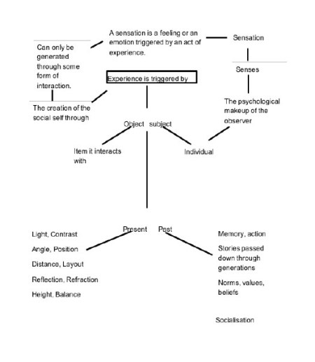
Table of experience:
Fades
This paragraph explores Drews viewpoint around the concept of fade looking heavily at the act of the sender and the receiver or in laments terms the Artist and the Viewer. Question the reality of an object within the push and pull factors that affect what the artist wants you to see and what you really engage with.
Structural connections between visual and aural elements of information within each video and painterly work create very specific thought processes. However to what extent and how reliable can one element of this information that we observe( an image or form) influence and condition another to feel a sense of emotion, meditative state or reaction to the work. Fading in and out of different perspectives of viewing transforms this question for me into a fundamental exploration of the content of perception, of the relationship between the sender and the receiver or in simpler terms the Artist and the viewer. ultimately, it is reality itself that is at stake. If the video and painterly works escape the specifically formulated reality of the physical object coherent within how can the work function as a push and pull against what the artist wants you to see and what actually is hidden behind closed doors. I want the work to impel itself upon the viewer to engage in a conscious observation and perception of reality whilst maintaining a meditative state of recognition and comfort. The work must fade away from representation to then draw us back into understanding the objects we observe, shifting between unease, chaos and lack of control.
The work must operate with a great deal and sense of complexity yet simplicity. The work must be formed of what appears to be complex synthetic man made phenomena which is based on a range of scientific principles, man made materials, textures and psychological principles. The images are often made audible so they create a psychological sense of sound that is within the boundaries of there observation. The work searches to be a metaphorical and actual search for tangible reality. moving between representation and non representation as way to encourage interaction and experience to take place on a physical level.
Aesthetic
Within my practice I have always been interested in the aesthetic quality of an object, video or form. Concerning myself often with the abstract nature of objects and how purity, contrast, line, rhythm tone and shape all effect the way we see an object itself. For something to aesthetically appeal an object must contain aspects that draw the eyes attention. My dissertation focused heavily on trying to put across this need to understand aesthetic quality and how abstract art, you could argue relies heavily on these basic psychological principles to define there work to make sense of there abstraction and why we the viewer find some form of simplistic yet valued understand of what they are trying to put across. Art relies both on the aesthetic nature of the work itself plus the context that it derives from. I find these arguments fascinating and they come across heavily in my practice and have always done so. Adding, constantly taking away, re-positioning, shifting, rotating, painting and reforming new ways to define an object within and out of the gallery or museum environment. One surface is never enough for me to feel comfortable. I feel the need to put something in front of behind, to the side, backwards, high up or hanging and draping. Every video frame is made up of layers, constantly being built, destroyed, taken away, deducted and re-layered again. Both areas of my practice follow the same process entirely. To say that layering is the only process of the creation of the work is not a fair statement. what is painting but the act of hundreds of layers being placed upon each other, adding more and more paint to define, take away or from the painting itself. Layering is my tool to create aesthetic control, balance and scale within the work. For me layering enables something new to be created, combining two objects, images together is not illustrating reality but concentrating it to generate a new form entirely.
key areas of aesthetic interest.
- contrast
- line
- form
- shape
- angle
- rhythm
- speed
- colour
Diegetic Consideration
Diegetic -“Sound whose source is visible on the screen or whose source is implied to be present by the action of the film: voices of characters. sounds made by objects in the story. music represented as coming from instruments in the story space ( = source music)
Non -Diegetic-:”Sound whose source is neither visible on the screen nor has been implied to be present in the action”.
Diegetic sound has become a relevant question within my practice to consider, is and should sound be detached from the visuals adding or completely changing how we feel about the work or should it be in tempo relevant and seductive to the works functions as an visual object in space. Sound can fill an environment can shape how we feel about a space, create an emotion that is for or against the visual stimulus that we engage with. However is this always a relevant addition to the imagery and is it necessary. I enjoy arguing over the importance of playing with sound, and how that can influence an audience. But it can also distract. Its finding the relevant balance between when this should be considered and when space enables sound to become relevant. space dictates every action in human life, it shares our feeling, moods our abilities, concentration. for sound the same human like approaches apply. They must be taken at ease. Consideration of detached or attached sound must be well thought out to maintain the songs individual purpose and that of the image, sculpture of form it is paired with.
Static
The idea centred around the term “Static” has come into play recently and has been a key focus in my work forming areas and forms within my practice, but also enabling a breathing point between the fast paced action that derives from the act of observing, enabling the viewer to pause, think, meditate about what they are observing. There is a great deal of interest both aesthetically and mentally when looking and or observing static. It disrupts, moves, fills the screen without given or generating any content that could have a symbolic, social or mental connection to the viewer, its the pure act of viewing nothing. The nature of looking at nothing but colour and static scenery of centres the chaos that lies behind the painting and video works. It creates a moment, an instant where the chaos can be stopped, where logic is left behind. Interplaying these moments alongside of the composition acts as a barrier of control. Creating hopefully an even more immersive sense of composition when observing. Sound can be considered yet also deducted from the frame. Static sound is not necessarily needed to generate desired effect. Sound must be subtle if used to of centre static control, keeping the viewer entranced to the potential nature of something re-appearing before them.
Reductive/ Instructions and Format
- Reduce
- Induce
It has come to my strong attention that the work is beginning to evolve and become even more reductive. There seems to be this Push and Pull effect happening where each transitional frame and every element placed in front of a painting is playing between reduction and induction. Giving presence to an object or form and then taking it away from them, by reducing its content through the use of Static, layering and shifts in motion, speed, colour and nature of the material itself. Reduction is become an instruction a format that the work must follow to stay true to its initial intentions. every painting and video follow the same processes of reducing, bringing back taking away again through layering in the physical world and in the computer. through adding pure colour on top of something representational to play with these Push and pull factors that the work faces naturally.
What Must the work Contain?:
- Rhythm
- Contrast
- Shape
- Shift
- Meditative
- Allude and Confuse
- Draw you in then push you out
Paint as a material
Paint is ever slowly becoming an important aspect of the work not as a tool to represent or generate mark making but to act as a material in its own right using the pour of the paint to become a sculptural element. Letting the paint dry on a range of surfaces from plastic, paper, wood and metal defines and generates a range of effects in which the paint may possess. The use of matt paint dry’s paler in colour and much more smooth upon the surface. Whereas Gloss paint dry’s with an interesting shine and sense of still being wet. I personally prefer the effects of gloss paint to the surface of the work itself. The application of paint to the surface changes in height and angle but is often left down to the paint itself in this particular instance. This form of application adds as a distraction that pushes back the chaos behind. A distraction of purely uncontrolled colour that forms its own natural pattern and form as it hits the surface of the sculptural or two dimensional surface. When paint becomes a material in its own right, (a solid material when poured) it generates an almost plastic quality, acting as a sculptural element.
What is paint:
“a coloured substance which is spread over a surface and dries to leave a thin decorative or protective coating.”
Oxford Dictionary:
Paint to me is not purely a coloured surface that is spread over a surface, but a decorative element that can be formed from a range of materials and substances. That create a painterly mark, not defined by the traditional application of a brush but by the way its hung, stapled, nailed or glued to the surface of the painting or sculpture. I often use the term Painterly to describe the act of making when in the studio and feel that when using materials unorthodoxly against the intentional nature of painting, that they become painterly in there own right. The term painterly is often used to describe a painting done in a style that embraces, shows, and celebrates the paint medium that it is created in (be it oil paint, acrylics, pastels, gouache, watercolor, etc.), rather than a style that tries to hide the act of creation. It is a loose and expressive approach to the process of painting in which the brushstrokes are visible, rather than one that is controlled and rational, and tries to hide the brushstrokes. Although often the works are not made with traditional paint mediums the act of placing wool in a expressive manner with no attempt to hide the actual purpose of the material I feel can be defined as painterly.
Material Properties
Wood MDF:
Medium Density Fibreboard (MDF) is a reconstituted wood panel product. It is a dry-processed fibreboard manufactured from wood fibres, as opposed to veneers or particles, and is denser than plywood and particleboard. MDF has an even density throughout and is smooth on both sides.
MDF is reconstituted into wood sheets in a variety of widths and lengths. Bonding is achieved by the addition of synthetic resin adhesives, which are cured under heat and pressure. Paraffin wax is added to assist with water repellency, while other chemicals can be added during manufacturing for more specific protection.
MDF is primarily used for internal use applications, in part due to its poor moisture resistance. It is available in raw form with a fine sanded surface or with decorative overlay such as wood veneer, melamine paper or vinyl.
PVC Plastic:
PVC more correctly but unusually called poly(vinyl chloride) is the world’s third-most widely produced synthetic plastic polymer, after polyethylene and polypropylene.
PVC comes in two basic forms: rigid (sometimes abbreviated as RPVC) and flexible. The rigid form of PVC is used in construction for pipe and in profile applications such as doors and windows. It is also used for bottles, other non-food packaging, and cards (such as bank or membership cards). It can be made softer and more flexible by the addition of plasticizers. In this form, it is also used in plumbing, electrical cable insulation, imitation leather, signage, phonograph records, inflatable products, and many applications where it replaces rubber.
Wool:
Wool is the textile fiber obtained from sheep and other animals, including cashmere and mohair from goats, angora from rabbits, and other types of wool from camelids.
Wool has several qualities that distinguish it from hair or fur: it is crimped and elastic. Wool fibers readily absorb moisture, but are not hollow. Wool can absorb almost one-third of its own weight in water. Wool absorbs sound like many other fabrics. It is generally a creamy white color, although some breeds of sheep produce natural colors, such as black, brown, silver, and random mixes.
Wool ignites at a higher temperature than cotton and some synthetic fibers. It has a lower rate of flame spread, a lower rate of heat release, a lower heat of combustion, and does not melt or drips it forms a char which is insulating and self-extinguishing, and it contributes less to toxic gases and smoke than other flooring products when used in carpets.[6] Wool carpets are specified for high safety environments, such as trains and aircraft. Wool is usually specified for garments for firefighters, soldiers, and others in occupations where they are exposed to the likelihood of fire.
Matt Paint
Modern Emulsions are water-based, with vinyl or acrylic resins added to make them more hard-wearing than traditional emulsions. This results in varying degrees of sheen in the finish; as the shine increases, the paint tends to be more hard wearing. The ranges usually offer matt, eggshell, silk, satin and full gloss.
Although normally thought of for use on internal walls and ceilings, there are water based types of emulsion specially produced for woodwork. These are easy to apply but do not give the same hard-wearing qualities as oil-based paints.
Vinyl matt emulsion gives a matt, non-shiny finish that is good for not showing small imperfections on the wall or ceiling. (The shinier finishes reflect back more light and highlight any imperfections). Generally speaking, however, it does not wear as well as the glossier emulsions.
Gloss Paint
Gloss paint contains very similar properties to that of Matt paint, however Gloss has a much shinier finish which generates stronger and more in-depth reflections of light when bounced of the surface or object. Gloss paint is often used as an overcoat applied after Matt.
Gloss paint, how its properties differs from Matt?
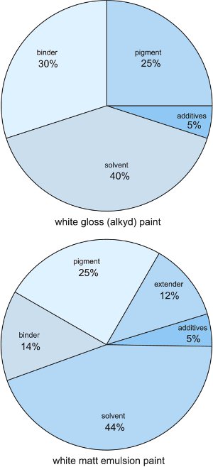
Source: The Essential Chemical Industry university of York. http://www.essentialchemicalindustry.org/materials-and-applications/paints.html
In the table above it shows the chemical differences between Matt and Gloss Paint. As seen above Matt Paint contains less binder ,a chemical to help the paint extend and a slightly higher solvent intake, in comparison to Gloss that shares the same proportion of pigment but higher proportion of binder and no extender. This example only forms valid for White Gloss paint and Pigment amounts may vary between colours. But It does show how vital of a science paint is and how very little changes in the paints properties can change and shape the paint behaviour when applied to a specific material surface. Each element is crucial, the slightest change in binder or Solvent can shape the quality and behaviour of the paint itself. I choose to use Matt and Gloss paint primarily because of the reflective and non Reflective qualities. They have very individual purposes, yet follow very similar ideals. Matt paint is flat and dries without a sheen to the surface. When dry almost looks pastel and the purity of the dusty pigment can be seen. Whereas Gloss paint mountains a sheen, a plastic like quality that hold its shape and maintains a thick glow on the surface. Examples Below:

Red Gloss Paint

Red Matt Paint
The Possibility of the Invisible (Richard Tuttle and Gary Hume )
Painting and sculpture as Richard Tuttle states often lies somewhere between itself, what it is and what it is not. A painting or sculpture has to enforces and push these boundaries for the audience to gain any form of experience from observing. The material in its natural state is the object( Itself) what it is defined by is decided by how me the artist shapes and changes the object creating something new leaving behind what it is not focussing instead on what it has become. For example if I take a carpet tile an object in its on right with its own identity, but I attach it to something new in a manor that a carpet tile is not traditionally used with, then the object itself changes gains a new identity, a new way of observing in the space. Taking away what the object is and making it what it is not. I feel that my practice heavily distinguishes between this idea, taking an object with a purpose a function in the everyday lives that we live and editing, changing there purpose, there chemical structure through peel elements of, ripping them apart or changing there colour.
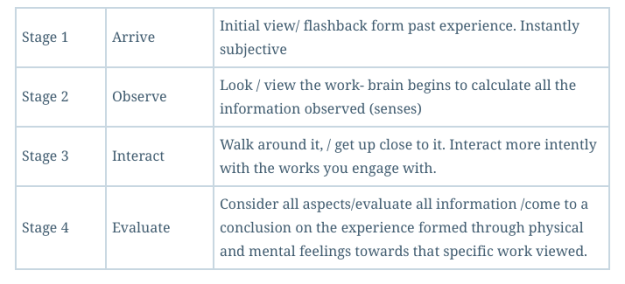
But how can we understand or view these changes when an object or form becomes what it is not. Gary Hume sees the distinction of observing a work in three stages. First you look at the image or form itself, then you engage with the reflection of the surface behind you, then you look at yourself. Its through Looking at the objects or image and then observing where they are situated in the space, what surrounds them, and then reflecting upon what you’ve seen through complex observation, matters of taste and reaction to colour, contrast, line, shape and tone to name a few. Although Gary Hume explores three important stages of understanding art, I feel he left a crucial element out. When you observe art you do first look, but I feel subjectively that you also (look at yourself) here aswell. Instantly when observing a work you will make a judgement, not based on observation but looking at past experiences, history, due to your own social upbringing, Class, Gender, Ethnicity, Status. Considering aspects of elaborated and restricted language. Its this initial stage of arrival
- Stage 1 Arrive Initial view/ flashback form past experience. Instantly subjective (Through Looking at yourself)
- Stage 2 Observe Look / view the work- brain begins to calculate all the information observed (senses)
- Stage 3 Interact Walk around it, / get up close to it. Interact more intently with the works you engage with. Whats behind you, look at your surroundings. How does the work surrounding what you observe change how you feel about it? Does other works distract you from the act of observing?
- Stage 4 Evaluate Consider all aspects/evaluate all information /come to a conclusion on the experience formed through physical and mental feelings towards that specific work viewed. ( Through Looking at yourself) Considering the knowledge of what you’ve seen, your feelings will shape your experience, your tastes, Interests in colour, line, tone,form and shape will effect how you feel towards that particular work.
Source: Richard Tuttle and Gary Hume
Colour and Light ( Colour as pure form)
Colour has become near the end of my Fine Art degree an important aspect to my practice. Colour now defines the work, draws the viewers in to observe, often looking to colour as they become more and more abstract in Nature. Colour is a complex field of study to grasp and is used in many artistic fields such as graphics design, film and media to encourage the viewer to observe and engage with a specific piece of material, object or sculpture. Within the field of graphic design and media colour is used as a method of sales and marketing opening up colour as a way to create your own personal individual self through your own understanding, Experiences or Taste. Colour in art is used as a focal point to make sense of the world we engage with, it forms part of a supremacist artist world, where colour is the purest form of art. Many artists of the mid twentieth century such as Malevich and Joseph Albers explored colour down to the bare essentials of simple forms, but intense simplified colour palettes, relying heavily on psychological and philosophical principles of art to define the understanding of how us the viewer will see the work. Colour is the key aspect to my practice and forms the basic of the work creating something that is aesthetically pleasing yet balanced, creating a mix of psychological emotions and responses to the colours used within the work. I want the work to appear familiar through the sue of everyday man made appliances combined with abstract painterly marks of Turquoise or violet shades of red and purple to draw the gazes attention to the other colours that are being combined within the composition as a whole.
During the early 1900 the Bauhaus provided a focus for a new kind of art, design and architecture that shaped a new era and understanding of colour. A new movement initially repsponsible by artist Johannes Ittenn arose called Vorkurs which stressed the importance of mysticism and experimentation as a means to self discovery. Ittenns primary focus was in colour and his theories still forms the backbone to colour theory courses in art colleges today. What made Ittenns approach to colour different was he did not limit himself to examining colour scientifically, experimenting with light waves and reflections or to a designers perspective, exploring colour relationships and visual effects. Itten taught his students to appreciate colour harmony- not in a sense of one colour influencing another but in terms of balance, as symmetry of forces. This was achieved only when colours were mixed not to a produce a new colour but to create grey. Itten wrote that ” Medium grey matches the required equilibrium condition of our sense of sight”, (John Wiley and Sons 1960)
Itten Believed That colour harmony is entirely subjective and that given time to experiment, each person would soon develop his or her own colour palette. Two Colour wheels where devised by Itten based on primary colours remain popular today.


Source: Tom Fraser: The complete guide to colour, Pages 44-50 718.1 FRA
Accessories and appliances. (Aspect of design in relation to practice)
Within my work an ever increasing interest in the everyday object and the found man made coloured materials are taking presidents. Ive began to consider the objects in the rooms we situate our selves amongst, and how these can have a great impact on its appearance and the way it is seen by the viewer. The number of objects we consider essential within the very environment of the home is constantly increasing leading for new coloured designs to take form to increase and force us to purchase particular products and or appliance. Prior to the mid nineteen thirties household devices and objects where marketed for there function and not purely there colour, however modern design and marketing has lead to the everyday object becoming much more elaborate and colourful in design using the knowledge of Semiotics to encourage and create a aesthetic in which may fit in a particular home design. During the digital era and the design of new plastic polymers new and unusual colours where being added to the home. The first distinct movement in this form of design was made by a movement called “Memphis”, by a designer called Ettore Sttsass whose designs where characterised by bright colours, rectilinear forms and a deliberate flouting of established rules. Effecting priorly the shapes and design of many household appliances leading way for the modern trends in design by companies such as Apple and Dyson who use colours to enable the consumer to define there home with a colour that suited there own taste, Beauty and Understanding. To create a sense of individualism amongst the accessories and appliances that we engage with on an every day basis. Colour effects our moods and intentions and what we engage with, so when you apply this to a household object does it effect the way in which we engage. Are we more repelled to hoover if the product is yellow in design in comparison to a grey hoover. We know that colour can often define a specific product, but with the launch of many colours in the market colour is becoming an accessory for us the consumer to divulge.
By using colour in a similar manor within my work, through combining objects that are manufactured on a mass production line, to create a specific design in the home and then combining them with Household paint by companies such as deluxe and Valspar ,I am creating a sense of everyday identity, pushing my now creative identity into the work, defining my practice as an extension of my own visual language of the world, “I” the Artist wants to live in. The Everyday object forms much of my current practice and I strive not to mix colours from the creation or intention of the manufacturer to stay true to the systems of design that we engage with on a daily basis. I wish to stay true to the colours used and to altar the colours of the objects purchased so that they become an individual item turning something that did not necessarily contain colour into a individual item that works in tandem with the rest of the objects that are coherent amongst the work.
Psychology of colour:
Grey-
Positive: neutrality,
negative: Lack of confidence dampness, depression, hibernation lack of energy.
Blue-
Positive: Intelligence, communication, trust, efficiency, serenity, duty, logic, coolness, reflection, calm.
Negative: coldness,aloofness lack of mention unfriendliness.
People who prefer blue re said to be conservative, accomplished, deliberate and successful. They know how to earn money and make the right connections. A rejection of blue indicates anxiety, a fear of loss of wealth and status. A preference for blue also indicates a desire for order and peace and an inner wish for benign life. Blue is not an easy colour for the eye to focus on and in blue light objects appear blurred and surround haloes. In industrial safety codes blue is used to mark equipment that may not be used without permission and for electrical equipment such as motors and generators.
Red-
Positive: Physical courage, strength, warmth, energy, survival, stimulation, Masculinity, excitement.
Negative: Defiance, aggression, visual impact, strain.
Exposure to red causes measurable reactions in the body . Blood pressure goes up, breathing and pulse rates quicken, sweating begins and brain waves are stimulated. The eye is at its sharpest under red Light. Red is one of teh most commonly preferred colours.
Green-
Positive: Harmony, Balance, refreshment, love, rest, restoration, reassurance, environmental awareness, equilibrium, peace.
Negative: Boredom, Stagnation, blandness, enervation.
Adults who prefer green are said to be well adjusted civilised and conventional people. On the other hand we describe someone as green if they are inexperienced or naïve. This is probably an association with the green of fresh young growth. A rejection of green is said to indicate a degree of mental disturbance and a complex lonely existence. Green surroundings are said to be good for meditation, and to encourage a purposeful state of mind.
Yellow-
Positive: Optimism, Confidence, self esteem, extraversion, emotional strength, friendliness, creativity.
Negative: Irrationality, fear, emotional, fragility, anxiety, suicide.
Yellow is said to be selected by people who are intelligent, who like innovation, who have great hopes and expectations and seek happiness. It is thought to be avoided by people who have suffered disappointments ad who consequently have a tendency to be isolated and suspicious. . Yellow is the brightest portion of the spectrum of colour and yellow and black is the most intense of all colour combinations. In industrial safety codes yellow usual indicates hazards such as low beams, and obstructions.
Orange-
Positive- Warmth, fruit, flowers, luscious, sunset Autumn
Negative- Fire, Danger, Toxic, Warning
People who favour orange are said to be cheerful with a ready smile, quick witted, talkative, to like company and desire action. However others have said that orange may be picked by those who suffer from physical and mental exhaustion. Research shows that orange environments improve social behaviour. Orange is a strong colour that stands out and is often used in factories to indicate gears, leaves and wires.
Purple
Positive- Spiritual awareness, Containment, vision, Luxury, Authenticity, truth, quality.
Negative- Introversion, decadence, suppression, inferiority.
Those who prefer purple are said to be sensitive and tasteful, with a liking for arts, philosophy music and ballet. They are temperamental with high ideals, and may be seeking enchantment or magical state in which their innermost wishes are fulfilled. People who dislike violet are said by some to be people who hate pretence conceit and vanity, and by others who avoid close relationships.
Source: Tom Fraser and Adam Banks: The Complete Guide to Colour. Accessories and Appliances Page 74-75. 718.1 FRA
Source: Robert Cumming and Tom Porter: The Colour Eye. Pages 17-31 718.1 CUM
The mysteries of perception, (How Materials effect how we see)
How the brain is put to creative effort
A good way to enter the domain of visual perception is to begin with a discussion of what psychologist calls modes of appearance for colour. The science of physics becomes largely irrelevant here: colour becomes a personal study, and the research laboratory is a persons on consciousness. A reader must turn away from the outer world of academic references to colour, to the world within perception. For example say you have a sheet of red glass, a sheet of red paper and a white light bulb and a sheet of white paper and a red light bulb. It is entirely conceivable that by holding the red glass to a window, illuminating the red paper with the white light bulb and illuminating the white paper with the red light bulb, three identical reds could be created. To a scientist these three reds would be identical but to a psychologist who looks at perception, the three reds would be very different. This is down to the materials in which teh colour is produced upon. One would look transparent in nature, the other a more opaque surface and the third like a red illuminated surface. Creating three different modes of appearance for the same colour. The experiment could be pushed further by adding more materials such as silk, wool, and liquid. All The reds would be the same physically but quite unalike psychologically.
There are two distinct processes of seeing with the eye in perception .
- Colour Constancy
- Human sense of illumination
You often find in the world of psychology that they speak of surface colour, film colours and volume colours.
-
Surface Colours- are those seen in the world , the colours of substantial things and objects. Some may have different modes of appearance, but they are tangible and touchable.
-
Film Colours- are seen in the sky. They are atmospheric and they tend to fill space. They have no substance.
-
Volume colours- are those that have a three dimensional Boundary. A jar of coloured liquid would have a volume colour.
Source: Faber Birren, Colour perception in art. The mysteries of perception, pages 34-36
The question that poses is are these distinctions viable to us the artists. personally I think they are the most valuable distinctions for an artist to understand. To be able to split materials into sections that follow different colour formalities enables work to become more diverse and complex pushing colour to its maximum, by exploring colour formats in a variety of ways. For artworks composition to be balanced we must explore a range of materials and how those materials colours, reflections, contrasts, and textures will change our perception when observing. For example:
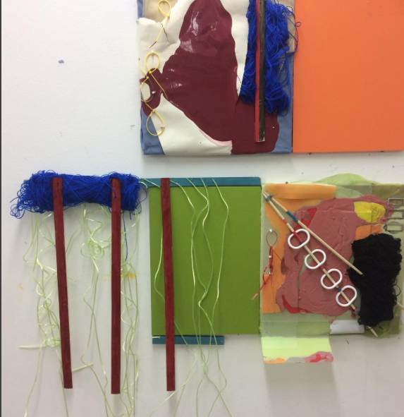
In the Painting above I’ve combined a range of materials from semi opaque plastics, Metal, wood and wool. They all absorb colour differently and react in very different ways. The red and orange paint on the right hand side has been painted onto a plastic surface underneath and on top. The paint dried quicker, and the colour oddly became duller when dry. The colour underneath was contained by the surface above. The green of pure colour stays strong to the eye. The black wool is strong in contrast but softer to observe than the green. The opaque string of green plastic softens the purity of colour behind and the dull red wooden strands break up the composition without being to intense. I’ve found that understanding the properties of each material and there relationship with colour and there reactions with light enables me to olay with them as objects in there own right, creating a more successful composition overall. Before I was adding colours and textures without understanding there properties and there intentions as colours. But now through Academic research and Artist research I understand the process of balance more intensely. Through looking at the practices of Richard Tuttle and Jessica Stockholder in Particular I’ve learnt the importance of combing different aspects of paint and texture to form a composition that reflects the three forms of colour in perception.
Colour and Taste
The connections between vision and taste Is a powerful one. Colour if applied to an unorthodox material, object or food can radically alter the individuals sense of taste , touch and interactions with that object. But more interestingly studies show that colour helps us to identify certain liquids,solids, and objects by there colour. Tests have shown that when blindfolds are added to a subject they Find it difficult to name the use, brand, taste and purpose. Associations with colour can create an array of sensory properties and phenomenon altering dramatically our perception of what we are observing. This USB known as synaesthesia and it plays a key roll in graphic design and marketing. It occurs whenever our exposure to colour produce so more than one stimulation that is when we cross-references the visual sense with other senses. We find this colour phenomenon applied to households appliance and packaging such as yellow bleach bottles to suggest a lemon scent, or red to suggest cherry or strawberry. Our attitudes to the colours of taste and their suitability to different products varies between types of products. A German market research project exaimined three different flavoures toothpastes which where labelled with three colours, green, blue and yellow. The research showed that mostly went for the blue and achieves that he highest score score , blue being associates with freshness. To a lesser extent freshness was also associated with the yellow tube, but this attribute was never associated with the tibe marked green. The test was repeated multiple times and the same results where achieved from there studies it can be determined that colour far outweighs flavour in the synasthesia impression it makes on us. Colour has a powerful influence not only on our ability to identify a flavour, object shape and form can ask one affect our estimation of a products strength, material and quality.
Colour Preference
colour preference has been a large question that has baffled scientists for years forcing us to consider why we like certain colours, looking at how the media, design and fashion influence our choices in colour when we enter a store. Colour is a complex human phenomenon and we all have our own individual sense of taste, beauty, past experiences and trends/interests with a specific colour. Colours will all jump out differently to us, but it is all down to how a colour is shown, what it is situated next to and how it reacts to an object in space. Colour preference redefines our ability to choose through and by the unconscious relationships that form between objects in space. The media takes colour and shapes how we the consumer react to the objects that we encounter on a daily basis. A study by a well known looked at children’s reactions to coloured smarties and added before the inclusion of a blue smarties a blue one to the mix. The results where interesting and it was shown that 90 percent of the children choose the blue as there top colour with red following second. This test shaped smarties and the inclusion of a blue one was added to the mix. The media take advantage of this ability for colour harmony and perception to take place. This is why colour is so fascinating because it the tool to influence how we interact, purchase, and choose to observe in a everyday environment.
Colour relationship
In any arrangement that uses colour whether it is a room, setting, packaging a painting or design the relationship between colours are as important as the actual choice of colours . Our response to any sensation can always be increased by using contrasts. A sweet can be made sweeter when you contrast it with something sour., hot and cold. Our perception also benefits from colour responses . There are not hard and fast rules about the way colour ought to be used, but a great deal can be learned by experimenting and observation. The first person to investigate colour relationship was business man and tapestry pioneer Michel eugere. He noticed that dyes used in his tapestry’s when woven together are dull , this lead him to investigate why certain hues when placed together lost there colour intensity.
Contrasts of hue:
pigments primaries- cannot be created by any other colours
- red
- yellow Most Intense Contrast
- blue
Secondary and tertiary Colours
- orange
- purple Less Intense Contrast
- green The more fragmented the colour wheel gets
Practice Vocabulary
- Fade -Blench, bleach, dull, etiolate, evanish, evaporate, grow dim, lose brightness, lose luster, muddy, neutralize, pale, tarnish, tone, wash out.
- Manufactured- assembled,built,complete,completed,constructed,done,erected,fabricated fashioned ,forged, formed, machined, mass-produced, shaped tooled.
- Everyday -average, accustomed, conventional, dull, familiar, lowly, routine, habitual, informal, mainstream, customary.
- Texture – balance, essence, fineness, flexibility, grain ,intermixture, nature, organisation, constitution.
- Colour- The quality of an object or substance with respect to light reflected by the object usually determined visually by measurement of hue, saturation and brightness.
- Form- anatomy, appearance, articulation, configuration, construction, contour, embodiment, outline, formation, skeleton, style, system.
- Static -Fixed, format, constant, gridlocked, immobile, immovable, stable, stationary, stuck, unchanging, unvarying.
- Man Made – counterfeit, ersatz ,factitious, false, manufactured, not genuine, Plastic, Synthetic, Unnatural.
- Pattern -Arrangement, decoration, device, diagram, figure, guide, impression, instruction, markings, mold, motive, original ornament, patterning, plan, stencil, template, trim.
- Repetition -Echo, recital, reiteration, repeat, replication, staccato, rote, rhythm, rehearsal, practice, periodicity, iterance, paraphrase, copy, chant , chorus.
- Meditative -Awake, Aware, cogitative, introspective, lucbratory, musing pensive, philosophical, prayerful, rapt, reflective, ruminant, thinking, thoughtful.
- Object- Body, Bulk, Gadget, Gizmo, reality, Volume, Mass, Matter, Entity, Commodity, doodad, phenomenon.
- Material – actual, appreciable, carnal, concrete, fleshy, incarnate, objective, perceptible
- Representation and Un-representation -Account, Chart, Icon, Model, Maps, Portrayal, Image, delegation, diagram, Protest, Sample, Sketch.
- Mark Making – Blemish, blotch, blot, line, logo, stroke, trace, symbol, scar, score, smudge, imprint, bruise, impression, signature, Brand.
- Hanging -Adhere, attach, cling, cover, furnish, sag, stay, float, flop, hold, hover, decorate.
- Found- Endow, commence, constitute, fashion, create, initiate, launch, organize, plant, raise, erect, fix, construct.
- Pouring – Discharge, Cascade, cataract, crowd, emit, issue, jet, rush, run, proceed, flood, deluge, decant, sluice, surge ,swarm ,teem, throng.
- Dripping -dribble, drizzle, exude, filter, plop, rain, sprinkle, trill, weep
- Painting- Composition, depiction, landscape, likeness, mural, oil, painting, Picture, portrait, portrayal, representation, seascape, sketch.
- Hammering-Bang, Batter, bear down, clobber, defeat, drive, drub, fashion, forge, form, knock, make, pound, pummel, tap, Thrash ,trounce, wallop,
- Screwing -Spiral, tighten, turn, twine, wind, work,
- Drilling -accustom, break ,habituate, hone, instruct, exercise, habituate, hone, teach, tune up,
- Gluing -attach, cement, cleave, cling, fasten, paste, stick, unite, freeze, cohere.
- Cutting – Acerbic, clear-cut, crisp, penetrating, piercing, scathing, stinging, sardonic, wounding, acrimonious .
